Extra Credit -
1. The man that was killed by the subway in New York, Ki Suk Han, was pushed onto the tracks by a panhandler after trying to calm him down because he was harassing another.
2. The photographer said he was trying to warn the tar in's operator by using his flash.
3. If the photographer thought he had enough time to capture one quick shot and then help Ki Suk Han, then sure, it would've been alright to take the picture, but that clearly was to the case so no, I don't think the photographer should've taken the photo.
4. No the photographer should have helped the man instead of taking the picture. If he would have helped the man step out of the tracks, he would be seen as a hero, instead he thought of himself and had to get the job done, now seen as a "vulture."
5. I completely disagree with the decision to run the photo on the front page of a magazine. It is incredibly unethical, they are posting a death on the cover of a magazine and it is just so wrong.
6. I feel like journalists are trained to put on a hard face and focus on just capturing the image so maybe for a very few who are more thoughtful in terms of what they are actually doing i the big picture, maybe those care about stopping things from happening but really most of these people have families and a home and they are only thinking about getting their job done.
7. It is totally acceptable for a photographer to get involved in a situation that they are photographing. If they capture a few good shots and still have the opportunity to help someone, they should do it.
8. Yes, photographers should avoid influencing events as they happen because the way I see it is, if they're gonna make something happen in order to take a picture, why don't they just go to a studio and create a fake scene like the one they want, there?
9. The response that stands out as most appropriate is that he used a lame excuse for not helping, how is the train operator supposed to infer from flashes that he is seconds away from running someone over?
Tuesday, December 16, 2014
Monday, December 15, 2014
Final Exam Review
1. Captions -
 |
| Thomas and Franklin taming Sparkles, the horse after a long afternoon of training for the circus. Sparkles' brother passed away 2 days ago and she has been having a hard time focusing on her work. |
 |
| Jeanette hugs her father, Joseph, tightly upon returning from college. Jeanette had been college bound for the past two years and this past holiday break was her first opportunity to return home to the U.S. from school in Sweden. |
2. Rules Of Photography -
1) Rule Of thirds: when the subject of the picture is not in the center of the picture, but off to the side, and either top or bottom of the photo
2) Balancing elements:
3) Leading lines:
4) Symmetry and patterns:
5) Viewpoint:
6) Background:
7) Create depth:
8) Framing:
9) Cropping:
10) Mergers:
Thursday, December 11, 2014
Fashion Photoraphy
1. Mouth enlarged, neck made longer and thinner, hair touched up, eyes enlarged, forehead made smaller, lighting and make up was touched up.
2. Facial features touched up, lighting touched up, shoulders raised, arms and stomach made thinner, legs made longer and thinner, feet made smaller, neck made longer, face made thinner.
3. Entire body made thinner, proportions changed, hair made longer and thicker, lighting touched up.
4. It is ethically acceptable to change the appearance of a person in a photo, but it is not acceptable to promote that photo as real. Changing someone's appearance in a photo doesn't do any harm to anyone as long as the subject agrees to the changes, but trying to pass the altered photo off as the real photo or just not saying the photo was altered is unacceptable.
5. The most ethically wrong would be in a non-fashion environment.
6. I think it is okay to change tiny aspects of a photo or the filter, but nothing that makes the person unrecognizable.
7. I think the differences between fashion photography and photojournalism photography is that in fashion, photos are doctored at another person's expense and are used as a photo to look up to and usually false advertise a product. In photo journalism, photographers edit photos for the learning experience and to please others, and I thinks it's more acceptable when photos containing things other than people are edited.
8. Fashion photography is an allusion compared to reality, and photojournalism is just a way to make things more naturally appreciated and beautiful.
9. I think you are showing us these three videos to clue us into what really happens to edited photos in fashion photography. These videos were a huge insight to me because I knew photos were doctored, but I didn't realize how extreme it was.
10. I think none of these videos are about men because most aspects in fashion photography appeal to women, their opinions and their style.
Magazines Part II
Early Magazine - I think the main attributes of the early magazines are the fact that they are sacred and set an example for the magazine world. The first ones came in the 1700's and 1800's and look very different than ours today: they were not in color, they're pasted on a different material of paper and are not very catchy. However, no matter how they look, the early magazines were a way, back then to inform others of more important information, rather than celebrities and affairs like today.
The Poster Cover - A large photo and title on the front page. The photo often did not directly relate to the content of the magazine. Poster covers are not very common now.
Pictures Married to Type - By the late 1800's and early 1900's, most of the artwork covers were on their way out. The magazine company's had started using a good combination of both the picture and words. Most magazines would have the title of the company and text about what you would find in the pages of the magazine itself.
In the Forest of Words - These use a large number of cover lines and a powerful image as the cover. Text often covers a large portion of the image and the cover.
My Favorite Cover
Favorite

"For W’s December/January Art Issue, the magazine collaborated with artist Yayoi Kusama to create this iconic cover image depicting George Clooney. The visually arresting image is the highlight of the cover story, for which five leading female artists were invited to create interpretive portraits of the actor. Clooney wears a suit painted by Kusama with her signature polka dots and stands against a polka-dotted backdrop. Planned to coincide with the opening of an exhibition of new work by Kusama at David Zwirner Gallery, the cover makes a powerful reference to the artist’s iconic self-portraits.
This magazine cover definitely caught my eye, making it my favorite. Even though some people may think polka dots are distracting or tacky, I believe the hot pink text stands out. Black, white and pink are great colors to put together, in my opinion. A photo rule that this magazine cover follows is simplicity, because it isn't too colorful, it uses only 3 colors. Also, there is nothing distracting happening in the background. I think this formal portrait is communicated as artistic, creative and able to give viewers the idea that the theme of this magazine's issue will include patterns of clothing and maybe a few famous people.
Best Magazine Covers 2013
1. Formal
2. Formal
3. Environmental
4. Environmental
5. Formal
6. Environmental
7. Formal
8. Formal
9. Formal
10. Formal
11. Formal
12. Informal
13. Environmental
14. Environmental
15. Formal
16. Environmental
17. Formal
2. Formal
3. Environmental
4. Environmental
5. Formal
6. Environmental
7. Formal
8. Formal
9. Formal
10. Formal
11. Formal
12. Informal
13. Environmental
14. Environmental
15. Formal
16. Environmental
17. Formal
American Soldier

This is the most powerful photo from the slideshow because it has very raw emotions. I understand this must be a very difficult time for them and its nice to see the contrast in their personalities.
Home in Denver: #1-7
At Basic Training: #8-30
At Fort Carson: #31-50
In Iraq: #51-70
Back in Denver: #71-82
I think the pictures taken at basic training were most powerful because they showed how Ian transformed and changed and they captured a lot of emotion.
The photos work together by following his entire journey in the military, showing his struggles and triumphs along the way, telling a story.
The verbs are in present tense.
The captions help tell the story that is shown in the photos.
Image #5 -
Ian sits with his father in their home before starting he starts his new life in the military. Ian's father does not want him to leave, but understands his reasons for doing so.
Image #51 -
| Ian stands in shock as he watches his best friend loose his life during the summer and stationed in Afghanistan. Ian struggled to stay on his game throughout the rest of his job that summer. |
Monday, December 8, 2014

Tuesday, December 2, 2014


Magazine Tips
When you design the cover of your magazine, you should keep in mind the familiar recognition from issue to issue, the emotions the reader will feel when they look at the cover, the arousal of curiosity, the intellectual stimulation, and make sure that it's worth the investment.
Wednesday, November 19, 2014


Friday, October 31, 2014
Environmental Portraits
 |
| I chose this picture because its very raw and it captures a very beautiful moment. |
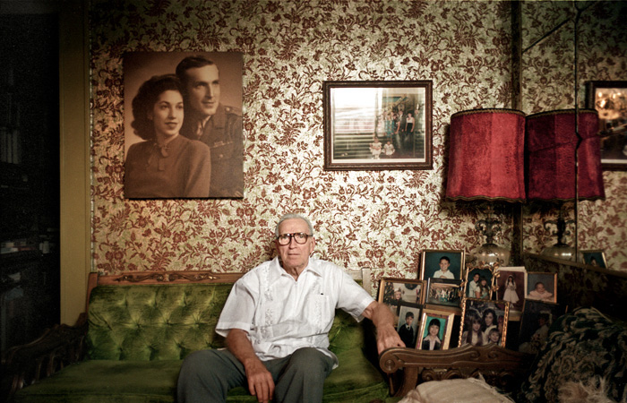 |
| I chose this picture because you can tell a lot about the man in the image and I believe it captures emotion. |
Portrait Tips
Play with Eye Contact
It is amazing how much the direction of your subject’s eyes can impact an image. Most portraits have the subject looking down the lens – something that can create a real sense of connection between a subject and those viewing the image. But there are a couple of other things to try:
A. Looking off camera – have your subject focus their attention on something unseen and outside the field of view of your camera. This can create a feeling of candidness and also create a little intrigue and interest as the viewer of the shot wonders what they are looking at. This intrigue is particularly drawn about when the subject is showing some kind of emotion (ie ‘what’s making them laugh?’ or ‘what is making them look surprised?’). Just be aware that when you have a subject looking out of frame that you can also draw the eye of the viewer of the shot to the edge of the image also – taking them away from the point of interest in your shot – the subject.
B. Looking within the frame – alternatively you could have your subject looking at something (or someone) within the frame. A child looking at a ball, a woman looking at her new baby, a man looking hungrily at a big plate of pasta…. When you give your subject something to look at that is inside the frame you create a second point of interest and a relationship between it and your primary subject. It also helps create ‘story’ within the image.
Fill the Frame
One way to ensure that your subject captures the attention of the viewer of your portrait is to fill the frame with their face.
It’s not something that you’d do in every shot that you take – but if your subject is the only feature in the shot – there’s really nowhere else to look.
Candids: Being Unobtrusive
You may want to make photographs of people going about their business—vendors in a market, a crowd at a sports event, the line at a theater. You don't want them to appear aware of the camera. Many times people will see you, then ignore you because they have to concentrate on what they are doing. You want the viewers of the image to feel that they are getting an unguarded, fly-on-the-wall glimpse into the scene.
There are several ways to be unobtrusive. The first thing, of course, is to determine what you want to photograph. Perhaps you see a stall in a market that is particularly colorful, a park bench in a beautiful setting—whatever has attracted you. Find a place to sit or stand that gives you a good view of the scene, take up residence there, and wait for the elements to come together in a way that will make your image.
If you're using a long lens and are some distance from your subject, it will probably be a while before the people in the scene notice you. You should be able to compose your image and get your shot before this happens. When they do notice you, smile and wave. There's a difference between being unobtrusive and unfriendly. Another way to be unobtrusive is to be there long enough so that people stop paying attention to you. If you are sitting at a café order some coffee and wait. As other patrons become engrossed in conversations or the paper, calmly lift the camera to your eye and make your exposure. In most cases, people either won't notice or won't mind. But be judicious. Don't keep firing away and become a nuisance. They will mind. You can also set the camera on the table with a wide-angle lens pointed at your subject and simply press the remote release when the time is right. Modern auto focus and auto exposure cameras make this easy to do as well.
Monday, October 27, 2014
Aperature
1. We should relate aperture to our eyes, the pupil.
2.The smaller the aperture, the larger the f-number. The higher the aperture the smaller the f-number.
3. Aperture impacts the depth of a field because it separates the foreground from the background so it makes objects sharp or blurry.
f/2.8
 |

Thursday, October 23, 2014
Cancer
As I looked through these images I got very sad to the point where tears came down my face. It was very emotional to see the woman's transition through cancer and process itself must be very exhausting. I think the comment the photographer made means that yes, this is what happened and this is what they went through but their story isn't limited to just the content of these photos. I definitely wouldn't be able to shoot photos if I was in this situation because I would be too emotional and too consumed in appreciating the last moments. If I could write a letter to Angelo, I'd tell him that he is very brave and strong to be able to document his wife's death. I'm sure it was incredibly difficult to surpass his emotions and take the photos. I would salute him for his wonderful photography and courageousness as I would thank him for taking me on a minute long emotional journey via a computer screen and photographs.
Tuesday, October 14, 2014
Captions
 |
| Here we have photographed Margaret on this past May 29th celebrating a very healthy century of life, she has taken very good care of herself her entire life allowing her to live this long. Margaret was very excited to reach "triple digits" and celebrated with a cigarette, one of her vices as an adolescent. |
 |
| Alfredo, Thomas, Julie, and Howard are high school friends, gathered here on the 7th of June to remember their lost friend Lisa. This bunch graduated in the class of 1951 and have been friends ever since, unfortunately, Lisa passed about 40 years after their graduation. |
 |
| Grace doesn't actually hate everyone, her granddaughter, Priscilla made her wear this shirt. Grace and Priscilla have a very good relationship, in fact, Priscilla is Grace's favorite grandchild. |
Tuesday, October 7, 2014
Great Black & White Photographers, Part 3
1st Photo
Next to this woman, the subject of the photo, I see the remains of a small party that ran very late. I smell coffee brewing and drunken morning breaths also the smoke from cigarettes. I hear people moaning in their sleep. I taste whatever a margarita tastes like and whatever cigarettes taste like. I feel the sun warming my skin.
2nd Photo
Standing beside this woman, I see a boardwalk with people walking by holding food in one hand and holding a frozen drink to their face with the other. Behind the people I see bars and restaurants lining the boardwalk. I smell salt water and the aroma of fried food. I hear people speaking amongst themselves and someone preforming live at one of the bars. I hear people applauding and singing along, I hear feet hitting the floor as they dance along. I also hear waves crashing on the shore and little kids laughing as the race with the water. I taste the saltiness of the air and the remains of the french fries I had just before walking over to the bay and standing in this spot. I feel the sun heating me, I feel my feet beginning to ache because I've been walking for so long.
Standing beside this woman, I see a boardwalk with people walking by holding food in one hand and holding a frozen drink to their face with the other. Behind the people I see bars and restaurants lining the boardwalk. I smell salt water and the aroma of fried food. I hear people speaking amongst themselves and someone preforming live at one of the bars. I hear people applauding and singing along, I hear feet hitting the floor as they dance along. I also hear waves crashing on the shore and little kids laughing as the race with the water. I taste the saltiness of the air and the remains of the french fries I had just before walking over to the bay and standing in this spot. I feel the sun heating me, I feel my feet beginning to ache because I've been walking for so long.
Mural
1. We could take on a theme about what people do on the weekends.
2. I think the cameras used should be open to whatever is available to the person.
3. I would like the mural to be somewhere with a plain background, maybe the cafeteria.
2. I think the cameras used should be open to whatever is available to the person.
3. I would like the mural to be somewhere with a plain background, maybe the cafeteria.
Friday, October 3, 2014
Academic Shoot Reflection & Critique
1. Trying to shoot these photos, I found it hard to find a subject that had all the right elements and followed the rules.
2. Shooting these photos I found myself thinking mostly of the focus, I tried to make sure that my subject was clear.
3. If I could go back and shoot these photos again, I'd take a few more photos of my subjects so that I could have more to choose from. Also I'd take more time to ensure that I capture a good photo.
4. I would us the same subjects because I think they're all really helped me follow the rules.
5. I believe that framing and rules of thirds will probably be the easiest rules to follow.
6. I think balance will be the hardest rule to follow because its not that easy to find a symmetrical subject.
7. I feel like I understand all the rules, it is clear to me what they mean.
http://brynsphotojournalismblog.blogspot.com
I really love how focused her pictures are, it is very easy to tell what/who the subject is. I also really like how most of her photos look so natural. One thing I would suggest is for her to have a better understanding of the rules, the rules she was trying to demonstrate weren't too clear to me.
Balance

1. I think I followed this rule well.
2. The subject of this photo is the group of students sitting at the table.
3. I would think that the subject in this photo is clear.
4. I think I followed the rule but if i could go back, i would try not to get the top part of the photo and I'd zoom in a little bit more.
Wednesday, October 1, 2014
Rule of 3rds

1. I think I followed this rule very well.
2. The focus of this picture is the girl doing her assignments on her free period in the library.
3. The subject is very clear to people looking at my photo.
4. I think I followed the rule well.
Lines

1. I think I did follow this rule well, however it could have been better.
2. The subject in this photo is the boy in the center painting.
3. I believe that the subject is clear to people viewing my picture.
4. I do believe I followed the rule well, however if I could go back, I would try to make it a shorter range so that the boy is slightly closer and also I'd try to get it from a lower angle so that it would seem more like the lines are leading up to him.
Simple

1. I think followed this rule very well, the background is 100% simple.
2. The subject of this photo is the girl writing.
3. It is very clear to people looking at my photo that the subject is the girl.
4. I followed the rule well.
Framing

2. The subject in this photo is Reagan browsing a book.
3. Yes, the subject in this picture is very clear to the people looking t my photos.
4. I believe I followed the rule well.
Thursday, September 25, 2014
Academic & Community Service
My favorite picture was the one of the girl pouring pink drops into a machine.
I chose this picture because i love how vibrant the colors are and I love how the photograph is focused on the paint splatter. In this photo, there is balance and it is following the rule of thirds.
Next class, for the shoot, I will probably take photos in the library or in an art/sculpting class, perhaps even a science class. I would like to visit Mrs. Lozano's Chemistry class, I am pretty sure they will be doing a lab. As a photographer, to take an amazing photo, I will keep in mind all the rules of photography and I will envision what I want my photo to look like before I actually take so that i will have more chances of taking an amazing photo.
The Story
Action & Emotion

This photo, in my opinion, shows the most emotion
of the bunch. The expression on the girls faces
shows that they're surprised.
Filling the Frame

This photo is very interesting. It's really cool
to see the colors coming from the sparks and the smoke.
Even though there is a lot going on, it all enhances
the photo.
The Story

This picture is telling a cute little story.
There is a community of people that got together to
raise money by selling hot dogs.
Tuesday, September 23, 2014
National Geographic

This is my favorite photo because the eye looks really good and detailed. I also love how you can see what the person is looking at. This photo is really cool to me.
I would submit a picture of the sky right after sunset. I love how it is different everyday and all the colors.
Touching People
1. I think this project is very interesting. The expressions on peoples faces are very intriguing.
2. I would go for it, I'm not sure i would be 100% comfortable but I would definitely do it.
3. It would be fun to take pictures of brides during their reception with random people.
4. I really like the photography. The pictures are very good and they capture peoples emotions/reactions very well.
2. I would go for it, I'm not sure i would be 100% comfortable but I would definitely do it.
3. It would be fun to take pictures of brides during their reception with random people.
4. I really like the photography. The pictures are very good and they capture peoples emotions/reactions very well.
Manipulation & Ethics
This story was about how the manipulation of photos is getting out of hand and all ethics are being put aside. Many of these edits are meant to be comedic however when they're put into context, they can come out to lack ethics and turn out to be offensive.


I think this type of editing is unethical because it deprive others from reality and truth.

I believe this photo to be the least ethical of the
collection. It strikes me as very personal when an edit
is made to ones physical features. To me, when the
edit something like this its the same as saying
'you're not good enough as you are, here, let me fix you.'
Maybe this person is already very conscious of their
appearance and for someone to point it out is mean.
I think thats very rude and its degrading the person.

I think this photo is the least unethical because it
isn't offending anyone personally. Of course, it is giving
false judgment of the geography however there were much
worse in this group of photos.
Post Shoot Reflection
1. During this shoot, I found it difficult to find a good subject that would symbolize the prompts well.
2. For this prompt I found myself thinking mostly of the focus, for example, in my metal picture, the entire focus was on the metal and the background was completely blurred.
3. If i could go back, I would probably frame the pictures and use the rule of thirds.
4. I would keep the subjects I used for the prompt, I really like my choices.
5. In my Square and Bowie photos, I captured balance well.
6. I would be interested in doing this shoot again so that I could use the skills and techniques that I learned.
http://kaitlynsphotojournalisblog.blogspot.com/2014/09/photo-shoot-prompt-favorites.html#comment-form
I really loved how her photos have a simple background. It makes the focus of the pictures very clear. I also really loved how creative her ideas were. One thing I would suggest is that she would get different angles of her subjects.
Friday, September 19, 2014
3 links
 |
| Kim Ho-Young / Reuters |
I chose this photo because I love the visibility of
genuine emotion. The composition of the photo
did attract my attention, how the focus is on
the man in the front. I think this photo made the
cut because you can see emotion.
 |
| Via vancouverhistory.ca |
I chose this photo because I love the concept of
whats happening. There is not much about the composition
of the photo that caught my other than how perfectly
centered it seems to be. I think this photo made the top
40 because it captures a very raw moment.
 |
| Jack Bradley |
I chose this photo because I love the moment that
it captured. The composition is not what caught my eye,
it was the expression on his face.I think this photo made the top 40 because of the same reason as I chose it.
it captured. The composition is not what caught my eye,
it was the expression on his face.I think this photo made the top 40 because of the same reason as I chose it.
Wednesday, September 17, 2014
Blanace

In this photo, there is a bunch of balance. There
are buildings spread out evenly throughout
the photograph and the smoke clouds are
mostly balanced as well.
Lines
In this photo, there are many lines that lead to the
subject. On both sides, there are buildings that lead
to the man which is the focus. Also, on the left there
is a sidewalk leading to him.
Simplicity

This photo shows simplicity because clearly the subject
is this woman. The background, although its not plain,
is one color and there is nothing that at first
glimpse will distract your eye from the woman.
Rule of Thirds

This photo follows the rule of thirds very well.
The firefighters are in the lift in the bottom right
corner and it really enhances the picture. Also, there
are two lines leading directly to them so it
makes the picture look really good.
Framing

This photo is very well framed. Theres the side of the
building on one side, theres the ground, and another
tilted post which helps draw attention to the
firefighters.
Mergers

This photograph includes distracting mergers. The
focus is obviously the guy with the white shirt and the
jacket but there are other people in the background
that are drawing my vision.
Monday, September 15, 2014
Great Black and White Photographers, Part II
Cindy Sherman
Cynthia "Cindy" Morris Sherman is an American photographer and film director born on January 19th, 1954 in New Jersey. She studied at Buffalo Stat College where she became interested in the arts. Cindy Sherman has published many books, mostly of her photography. Her most popular stills are the"Untitled." Presently, Cindy is 60 years old and lives in West SoHo, Manhattan.


The Camera
1. The "camera obscura" effect is Latin for "dark room". The effect was obtained because the hole acted as a lens, focusing and projecting it onto the wall of a dark chamber.
2. The invention in the 17th century that helped man get closer to creating the modern camera was the high quality glass lenses.
3. Niepce created the first modern camera with a dark box,glass lens and film.
4. Modern cameras are still composed of the same parts as Niepce's original camera.
5. Digital cameras, as opposed to plastic film in the old-fashioned ones, capture the image with an electronic sensor called a CCD.
6. In Auto mode, the camera controls the flash and the exposure while in Program mode, you can control flash, exposure, and a few other minor settings.
7. Portrait mode is used to focus on only your subject and blur the background, you can adjust it using the aperture setting.
8. Sports mode is used to freeze motion, it will use the highest shutter speed possible.
9. You would use the half press because it helps the camera response time, you'll have more control over focus, and it encourages better position.
10. The symbol means "Disabled Flash," meaning no flash. You would use it if you didn't want any flash at all or to make the photograph more dramatic with natural light.
11. This symbol means the flash is on auto. On most cameras, the flash will fire if it thinks the picture needs more light.
12. If there is too much light, the picture will be washed out.
13. If there is not enough light, the picture will be dark.
14. A "stop" is a relatie measure of light.
15. The new planet is 1 stop brighter if there are two sons instead of one.
16. The new planet is 2 stops brighter if there are four sons instead of two.
17. A longer shutter speed will cause there to be more light.
18. A shorter shutter speed will cause there to be less light.
19. The aperture controls the light that passes through.
20. When adjusting the aperture, you can increase th amount of light by making the opening larger.


Strange Alien Faces
1. I think the unique idea is very interesting, its a very different perspective and it shows how one-sided we are about how we view the world.
2.It didn't take me time to figure out what the pictures were, mainly because the title of the page explains it.
2.It didn't take me time to figure out what the pictures were, mainly because the title of the page explains it.
Subscribe to:
Comments (Atom)